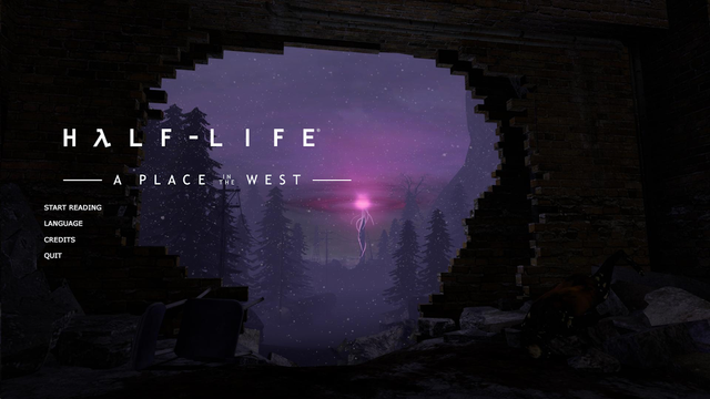
Here's a menu background from our old app, with work from Aaron Garcha and Maarten Frooninckx. It's a shame we don't use it any more, because it's so lovely.

Here's a menu background from our old app, with work from Aaron Garcha and Maarten Frooninckx. It's a shame we don't use it any more, because it's so lovely.
the old main menu looked like a source game.
That, indeed, was the goal.
Perhaps you could have an option to return to this menu? I agree, I think its very atmospheric, and it makes the comic feel more immersive.
We shall do so.
A great background !