CybrFox

CybrFox

@cybrfox
Joined 3 Jan 2024
Badges
Guard Duty
Guard Duty
Showed up for a rather blue shift #ShiftingTheBar
Follow
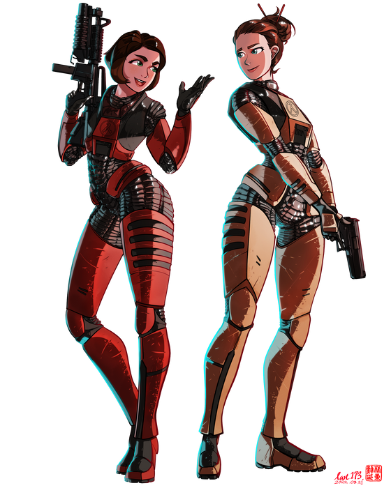
Colette Green & Gina Cross

Wishing for the successful launch of 'PEER REVIEW', a remaster of Half life: DECAY!

+ SORRY for deleting old one and  reuploading this work! I made the mistake of turning off one layer, so the final piece wasn't uploaded! Please enjoy!

Colette Green & Gina Cross Wishing for the successful launch of 'PEER REVIEW', a remaster of Half life: DECAY! + SORRY for deleting old one and reuploading this work! I made the mistake of turning off one layer, so the final piece wasn't uploaded! Please enjoy!

decay47
thanksalotblackmesa28
colette33
gina32
soldierface13
alyxpog7
I went through so many different stages of stylizing the characters but I'm very happy with how I draw them now. Older concepts in the collage. I just thought the old ones were a little bland and boring especially while drawing them. They didnt look "fun" so i decided to just focus on shapes rather than try to follow a reference. 
G-man one was a request c:  

I like Gordon being squares and rectangles. Tall and lanky but still with enough big shapes to give some strength. I did start with giving Gordon's suit normal sized arms but thought it looked a bit boring so BIG SUIT ARMS HELL YA 
Barney tho I just think I want him to have shorter sharper shapes so traingles are really nice and makes understanding drawing his helmet way easier for me while emphasizing other features like cheekbones and jaw and I like the way it makes him look more abstract

The contrast between the shapes makes for a goofy yet nice dynamic when drawing them together c:

I went through so many different stages of stylizing the characters but I'm very happy with how I draw them now. Older concepts in the collage. I just thought the old ones were a little bland and boring especially while drawing them. They didnt look "fun" so i decided to just focus on shapes rather than try to follow a reference. G-man one was a request c: I like Gordon being squares and rectangles. Tall and lanky but still with enough big shapes to give some strength. I did start with givin…

(Edited)
scream21
consulsmile20
kovacsmile20
barneysmile20
deadass15
alyxpog5