

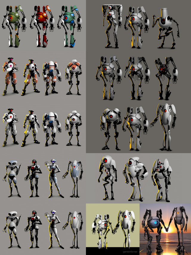
Exploring Valve Archive, part 20. valvearchive.com>archive>Portal>Portal 2>Art>Robots> Developing an iconic look for Atlas and P-body was very important to the designers at Valve, as a heavy focus of Portal 2 was placed on its cooperative campaign. They initially experimented with more humanoid robots with a very "Westworld feel"; they wanted them to "look human, but feel robotic" according to Valve's Matt Charlesworth. Despite this initial goal, the designs naturally developed into less humanoid, more abstract figures, integrating the design of turrets and personality spheres into P-body and Atlas respectively.
 17
17
I think they made the right choice. Cool designs though.
Many of the others look too aggressive/threatening and that was not the look they wanted for these characters.
The four concept art ideas on the right all look really fucking sick
The twenty-third one got some balls