

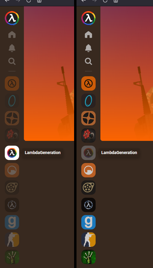
My one bit of feedback would be to invert to selection scheme for the community buttons. Greyed out generally conveys that it can't be interacted with, leading to a weird mental disconnect. Buttons should look pressable! Especially jarring on mobile.
👈
Aaayyyy, lookin' more user-friendly already! I won't dock ya points for mobile. Y e t
First one good!
Neither