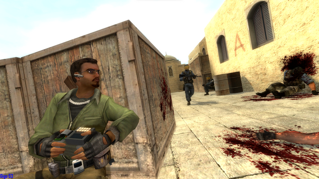
I think there's room for improvement, but for now I think this is fine. "Counter-Strike Source: 1v2" This is one of my first creations in terms of screenshots, posing and lighting: any useful and constructive advice and tips are welcome. This was originally on "Screenshots", but I moved it to "Artwork" because I thought that it's more fitting.
(Edited)
 2
2 2
2